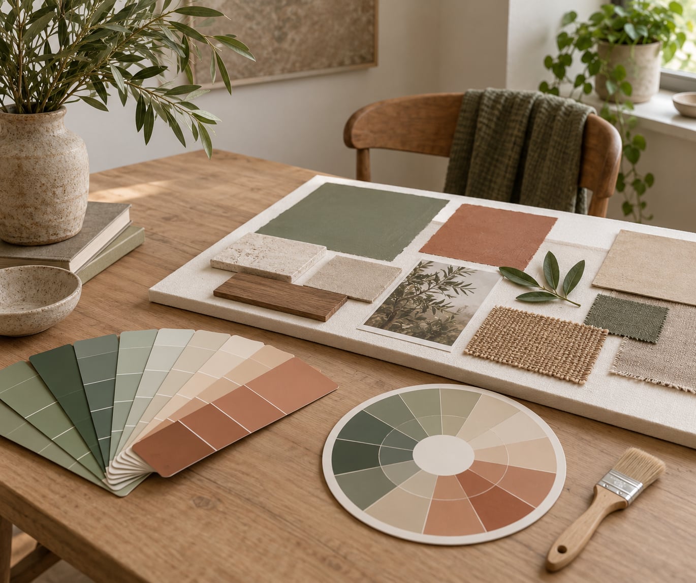
Interior paint colors work together when they share an undertone and sit in the right proportions: roughly 60 percent of the room in one dominant color, 30 percent in a supporting color, and 10 percent in an accent. That pairing is the whole trick. Get it right and a room feels settled; get it wrong and every color seems to argue with the next one.
Paint is the largest visual surface in a room and the easiest thing to change, which is why so many people treat color as the cheap part of a renovation. It is also the part that is hardest to undo. A bad sofa costs nothing next to repainting three rooms you now hate. This guide walks through the actual order of operations, from the colors you cannot change to the swatch you tape to the wall on a Saturday morning.
It takes about two weeks of sample living before you buy a gallon, and most of the mistakes I see come from skipping that part rather than from picking a bad color.
Table of Contents
- What You Need
- Step-by-Step: How to Choose Paint Colors That Work Together
- Step 1: Choose a Dominant Color and a Supporting Role
- Step 2: Check the Undertones Before Combining Colors
- Step 3: Use a Simple Color Relationship
- Step 4: Test Paint Colors That Work Together on Large Sample Surfaces
- Step 5: Evaluate the Colors in Different Light
- Step 6: Apply the 60-30-10 Rule, Then Adjust
- Step 7: Make the Final Paint Decision
- Common Mistakes
- Frequently Asked Questions
- How do I know which paint colors work together?
- What colors go well with warm white paint?
- Should all walls in a house be the same color?
- How many paint colors should I use in one room?
- Can I use paint samples to choose a whole-room palette?
- How do I choose paint colors that work with existing wood floors?
- Conclusion
What You Need
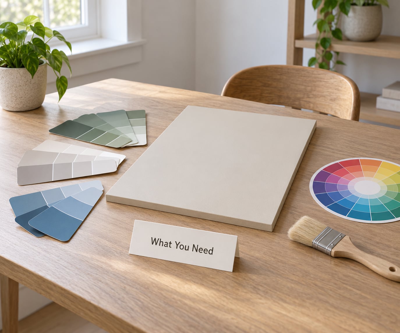
You need surprisingly little, and all of it is cheap or free. Gather it before you start choosing anything, because the palette decisions get much easier once the evidence is in front of you.
- Small paint chips. Collect the ones you already like, plus a few you think you might like. Bring them home rather than judging them under store lighting.
- Two to four large sample boards. Peel-and-stick boards around 24 by 16 inches are the standard choice. Their size matters, because a chip roughly the size of your thumb tells you almost nothing about a wall.
- Painter’s tape. For taping boards to trim, to doors, and to walls you do not want to mark.
- Samples of the finishes you cannot change. A cabinet door sample, a countertop tile, a flooring plank, a backsplash tile. If you can lift a loose piece or take a photo in good light and match it at the store, do that.
- Your textiles and wood pieces. Sofas, rugs, curtains, cabinet pulls, wood tones. Paint has to live with all of it.
- A color wheel. A printed one or a free app. You need it to see relationships, not to admire it.
- A note about your light. Which rooms get morning sun, which get afternoon sun, which get almost none, and what color the bulbs are. Older bulbs run yellow, newer LED bulbs run cool, and both shift paint noticeably.
- A spare hour on a Sunday. This is the real requirement, and the one people skip.
If you want to save money, skip the small chips entirely and buy two or three large sample boards. That is where the useful information is. Store chips are tiny, printed on thin paper, and lit by whatever the ceiling is doing that day.
Step-by-Step: How to Choose Paint Colors That Work Together
Step 1: Choose a Dominant Color and a Supporting Role
Pick one dominant color and one supporting color, then add a small accent only if the room needs it. Paint, furniture, and textiles all count toward those three roles, and paint is usually the dominant.
The order matters. Start with the fixed finishes, not with the color you like most. Cabinets, countertops, backsplash tile, flooring, appliances, and window frames cannot go back on a shelf, and they cover large areas, so they get to set the direction. Flooring in particular pulls a lot of visual weight in most rooms.
Once the fixed colors are recorded, choose the dominant. It should be the color that still looks right on a dull Tuesday, not the one that looked best in a sunny showroom. Then choose a supporting color that sits beside the dominant rather than fighting it. Most rooms are calmer with one dominant and one support than with three equal voices.
Step 2: Check the Undertones Before Combining Colors
An undertone is the quiet color hiding underneath the one you see. A gray can be warm, cool, green, pink, or yellow underneath, and that hidden color is what decides whether two colors look like relatives or strangers.
Reading an undertone takes about a minute. Hold the chip flat and tilt it under the brightest light in the room until the surface sheen disappears. Look at the color that seems to leak out around the edges, especially where the chip meets white paper. Then push the chip next to a piece of pure white and watch which way it shifts.
- Warm means yellow, orange, or red underneath. Warm colors feel cozier and more inviting, and they lean yellow or beige rather than blue.
- Cool means blue underneath. Cool colors feel crisper and calmer, and they lean blue-gray rather than beige.
- Green undertone is the one people miss most. It makes a gray look sickly next to warm wood and makes a white look dingy.
- Pink undertone shows up in some whites and soft blues, and it can look strong against cool grays.
- Yellow undertone is what makes a white look creamy rather than clinical.
Undertone fights are the most common reason colors that looked good together in a store look wrong on your wall. A warm gray next to a cool gray in the same room pulls against itself, and the room feels unsettled without anyone being able to say why. Pick one undertone family for the walls and keep the supporting color inside it or in a neutral that bridges both.
Step 3: Use a Simple Color Relationship
Four relationships cover nearly every home: monochromatic, analogous, complementary, and neutral-with-color. Understanding which one you are using makes the rest of the process mechanical rather than a guessing game.
A monochromatic palette uses one hue at different values, which is the quietest option. A analogous palette uses neighbors on the color wheel, usually blue-green with green, or blue with blue-violet. A complementary palette pairs opposites, which is livelier and only works when one color clearly dominates. A neutral-with-color palette puts a soft or off-white wall behind a single saturated accent, and it is the most forgiving setup for a first-time painter.
Three shorthand rules float around for this, and all of them are really the same idea in different clothing:
- The 60-30-10 rule means 60 percent dominant, 30 percent secondary, 10 percent accent. It describes visual weight, not square footage, so a small vivid accent counts as heavily as a large muted one.
- The 3-color rule means limiting yourself to three colors per room plus trim, which keeps a space from turning into a swatch book.
- The 3-5-7 rule means roughly 60 percent of a room in three shades of one color, 30 percent in a main supporting color, and 10 percent in accent and textiles. It is a monochromatic version of 60-30-10.
Pick one and follow it. Mixing two rules halfway through a project is how rooms end up with an accent color fighting three other accents.
Step 4: Test Paint Colors That Work Together on Large Sample Surfaces
Small chips fail almost everyone. Tape your candidate colors to large boards and put the boards on the actual surfaces they will occupy, not on one convenient wall you will never see again.
A workable protocol: buy eight to twelve boards, cut them to roughly 24 by 16 inches, and tape at least four of them in the room over a weekend. Put the dominant candidates on a main wall, one board next to the flooring and cabinets, one beside a window, and one on a wall that only gets indirect light. Leave them up for at least 48 hours so you see the color under morning, midday, and evening light.
Move the boards. Set one next to your sofa, one next to the curtains, one next to the wood trim. Paint reflects off whatever surrounds it, so a color that reads clean on an empty wall can pick up a green cast next to a forest green sofa. If you can, borrow a piece or two of the furniture you already own and put the boards in place of where it will live.
Step 5: Evaluate the Colors in Different Light
Check your samples three times a day: around 9 in the morning, at the brightest point of the afternoon, and after dark with your normal bulbs on. If a color only works in one of those windows, it is the wrong color for that room.
Orientation matters as much as time of day. North-facing rooms get cool, bluish light all day and make warm colors look muddy, while south-facing rooms get strong warm light that can push soft whites and pale yellows toward cream. Rooms with dark hallways next to bright living spaces create the reverse problem, where the same chip looks grey in the hall and warm in the sun.
Look for glare and reflections, too. Satin and semi-gloss finishes bounce light and exaggerate flaws and color casts, and a hallway with a single overhead fixture will show any unevenness fast. Keep the boards up through at least one evening before you decide, because artificial light is where many palettes fall apart.
Step 6: Apply the 60-30-10 Rule, Then Adjust
Distribute your dominant, secondary, and accent colors across the room, then adjust the balance where the architecture demands it. Paint is usually the 60 percent, a piece of furniture or a wall treatment takes the 30, and the accent is the 10.
The rule describes visual weight rather than measured area. If you love a saturated blue, a smaller wall in that blue can carry the dominant role if it is the most saturated thing you can see from the doorway. If your cabinets are already a strong color, they may be doing the work of the accent whether you like it or not, and your walls should stay quiet.
Adjust when something is fixed. Dark hallways and low-ceiling rooms usually need a lighter dominant, not a darker one, since the extra light value makes the space feel taller. Small rooms often look better with one dominant and one accent than with two competing wall colors. Personal preference outranks every rule on this page once the colors share an undertone and the proportions are close.
Step 7: Make the Final Paint Decision
Compare your last two or three swatches side by side on the wall, then write down the exact names, the finish, and the sheen before you leave the house. Memory is unreliable at paint counters, and two greiges that look identical on a board can be clearly different under store lighting.
Buy small test quantities first when you are still torn, and finish is part of the decision. Flat and matte finishes absorb light and make a color look softer and slightly deeper. Eggshell and satin reflect more, which usually makes a color look a shade lighter and more saturated in a dark room. Semi-gloss is reserved for trim, cabinets, and doors. Pick your sheen before you buy paint, not after, because the same color genuinely looks different across them.
Plan trim and ceilings at the same time. A bright white ceiling makes a room feel higher, and off-white trim warms a room while a stark white can look cold against warm walls. Painting ceilings and trim in the same trip avoids visible lap marks between a ceiling and a wall of different sheen.
Common Mistakes
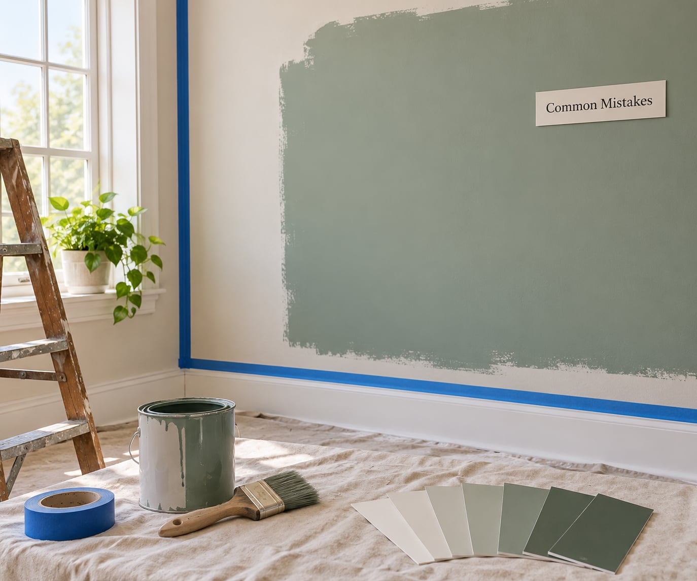
Almost every disappointing paint result traces back to one of a handful of avoidable moves.
Choosing from small chips in the store. Store lighting flattens everything and the chips are too small to judge. Correction: buy large sample boards and look at them in your own room before buying paint.
Ignoring undertones. Two grays that look identical in the aisle can fight each other on the wall because one is warm and one is cool. Correction: pick one undertone family for the walls and stay inside it.
Starting from the color you like instead of the finishes you own. Painting around cabinets, counters, and floors you cannot replace is the most expensive kind of second-guessing. Correction: photograph and sample those surfaces first, then choose the wall.
Forgetting fixed architectural colors. Door frames, built-ins, brick, and a stained ceiling will fight a palette that ignores them. Correction: list every fixed surface on paper before you pick a single chip.
Adding too many competing accents. Every extra strong color divides the room’s attention until nothing leads. Correction: cap the room at one accent and pull the others into textiles or small objects.
Skipping the final light check. A color approved at noon can look flat at 8pm under lamps. Correction: leave samples up through one full day and one evening.
Buying gallons before testing. Paint is returnable in some conditions and not in others, and tone differences between batches are common. Correction: finish the sample window first, then buy what you need.
Two habits prevent most rework. Write the room’s fixed colors on one sheet of paper and keep it visible through the whole decision. Then move your samples to three different rooms before committing, since a color that works in a bright living room can fail badly in a dim hallway.
Frequently Asked Questions
How do I know which paint colors work together?
Two colors work together when they share an undertone and are used in different visual weights. Compare chips side by side on white paper and check whether both lean warm or both lean cool. Then set proportions, roughly 60 percent dominant, 30 percent supporting, and 10 percent accent. If one color only works beside one specific partner, treat it as an accent rather than a wall color.
What colors go well with warm white paint?
Warm white paint pairs well with earthy, mid-tone colors, so think terracotta, olive, muted teal, clay, camel, and warm wood. It fights cool-leaning colors, because a blue-gray or a cool white next to it makes both look dingy. Warm white also needs warm trim rather than stark white, or the trim will read as slightly green against the walls.
Should all walls in a house be the same color?
No, and a single color everywhere often flattens a home. A common approach is one wall color through the main living spaces, a related shade in bedrooms and bathrooms, and one accent color used sparingly in a couple of rooms. Keep trim consistent throughout, because repeating a single trim color across rooms is what makes separate spaces feel connected.
How many paint colors should I use in one room?
Three per room, plus trim, is a workable limit, and most rooms look better with fewer. Count paint, furniture, and textiles together, since a patterned sofa introduces several colors already. If the room has strong fixed finishes like dark cabinets, drop to two wall colors and let the accent come from something small like artwork or a rug.
Can I use paint samples to choose a whole-room palette?
Yes, and large samples are the best tool you have for it. Buy eight to twelve boards around 24 by 16 inches, tape them on the walls you will actually paint, and leave them up at least 48 hours. Check them in morning, afternoon, and evening light, then move each board beside your flooring, cabinets, and furniture before you commit to a palette.
How do I choose paint colors that work with existing wood floors?
Read the undertone of the floor first, not the stain color name. Honey oak, golden oak, and walnut generally sit on the warm side, so warm off-whites, soft taupes, and earthy greens look natural beside them. Cooler gray floors lean toward crisp whites and cool grays. Sample the floor tone on a board and hold your wall candidates next to it before buying.
Conclusion
Start by writing down every fixed color in the room, the cabinets, the floor, the tile, the doors. Choose one dominant hue that shares an undertone with those, tape a small palette onto large sample boards, and leave them up for a full day and evening before you buy anything.
That single weekend of patience is what separates a room that works from one you keep thinking about repainting.